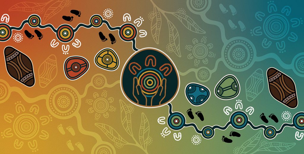
Mob Strong Artwork by Dixon Patten, Bayila Creative
The Mob Strong logo was designed guided by the attributes of the not for profit service: providing connection, a culturally safe place, education and awareness leading to empowerment, advocacy, support and communication. Dixon used symbols to convey the coming together of people and community for the support that Mob Strong offers. Elements within the artwork have been chosen for their strength and growth – both aspects of Mob Strong’s work to share with their callers. The gum leaves for growth through education, the shields for protection within this culturally safe space, and the healing stones to represent the counselling work of Mob Strong.